Creating an illustration like image from photos - part 2
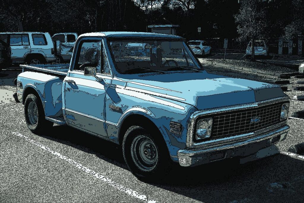
Last time, I used K-means clustering to do dimensionality reduction of images to convert photos to images like Eizin Suzuki’s illustration. The converted images look like an illustration, but the color tone was very dark and it was far from the pop flavor art that the illustrator draws.
In K-means, the centroids of clusters are color information from 0 to 255 of RGB, so I thought that if I create higher saturation number of RGB and overwrite the original centroid data with them, it will become colorful images. Therefore, I investigated how to enhance the saturation of RGB data.
I studied RGB, HSB or CMYK color systems for a while, but I found it was difficult for me to change RGB numbers intuitively to make the centroid colors brighter. While doing so, however, I learned that I can easily adjust color using the Python library Pillow, i.e., Pillow's ImageEnhance module. Sharpness, saturation, contrast, and brightness of images can be adjusted by increasing or decreasing from the original factor 1.0. The link concerning Pillow ImageEnhance module is here.
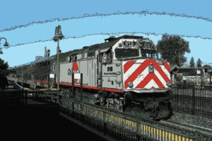
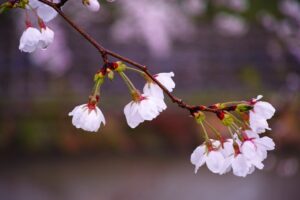
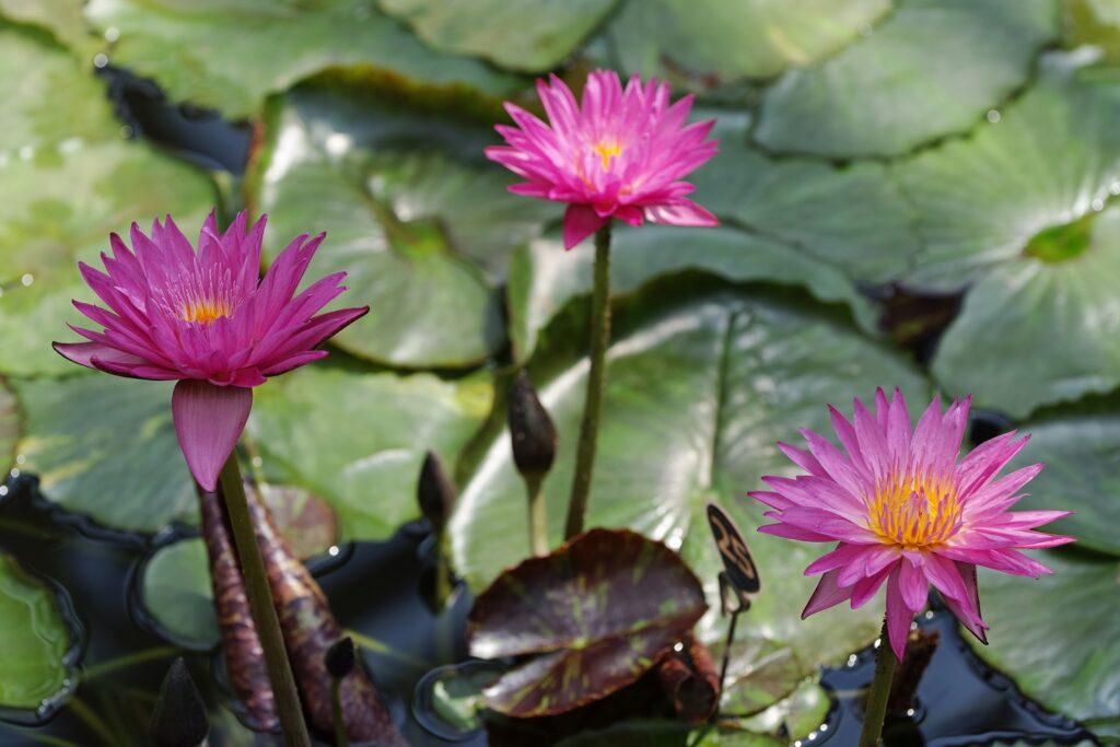
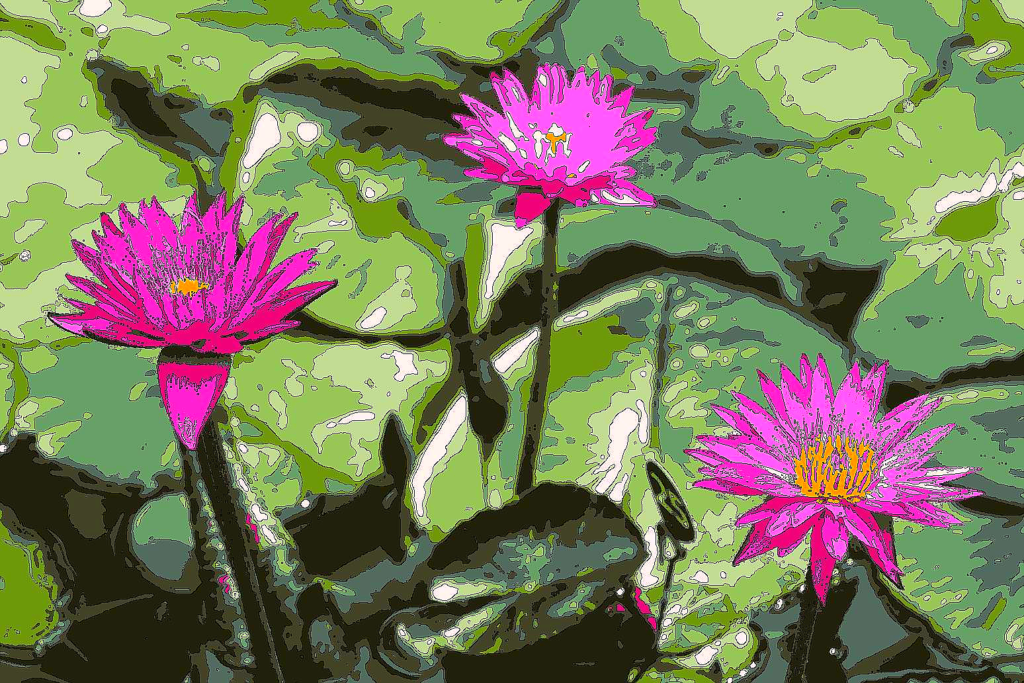
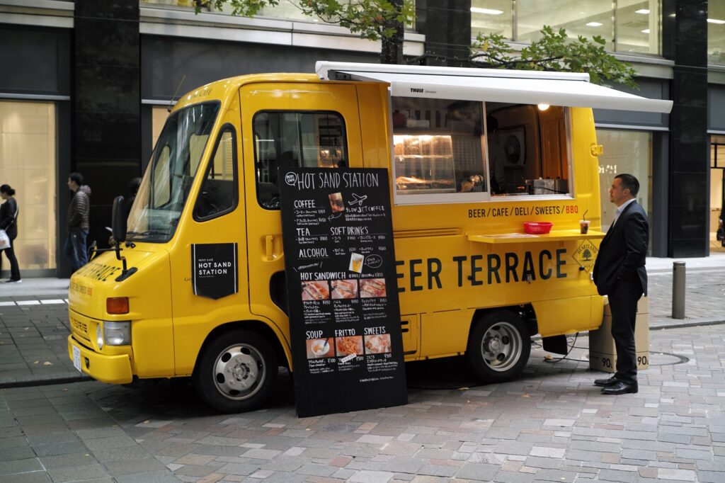
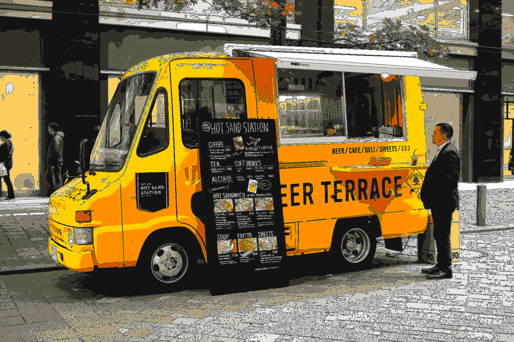
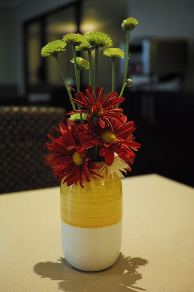
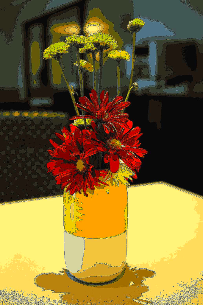
An example using the same image from the previous time is like this.
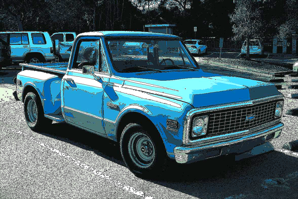
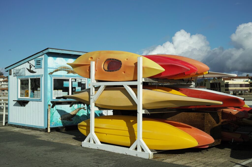
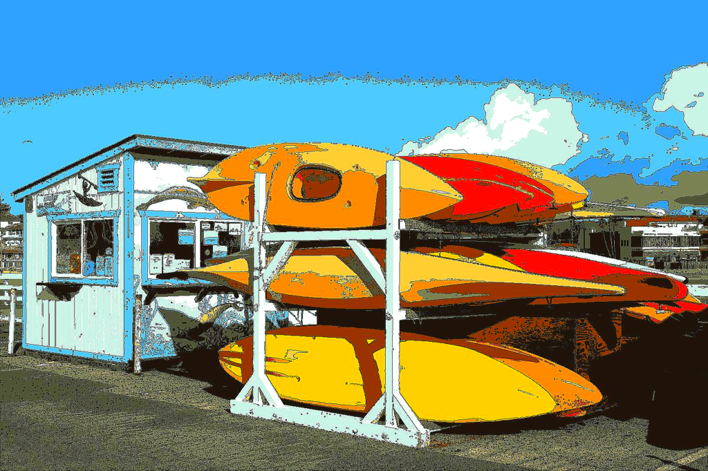
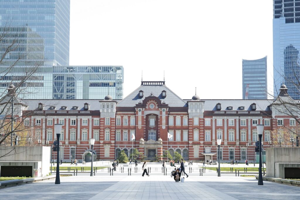
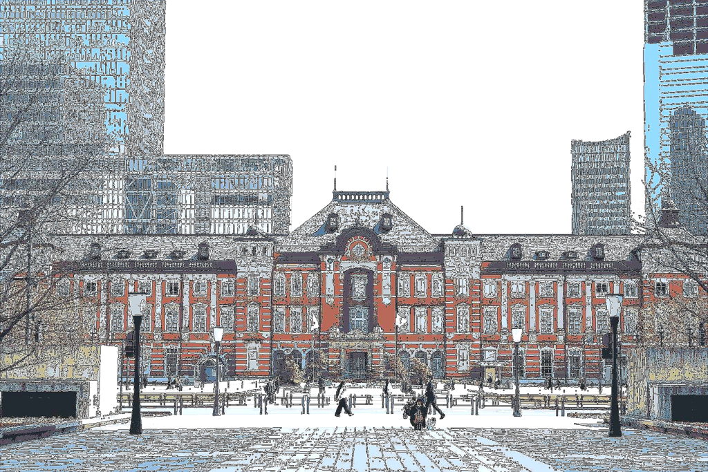
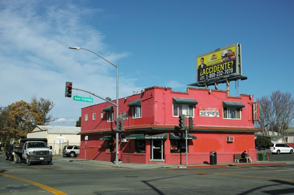
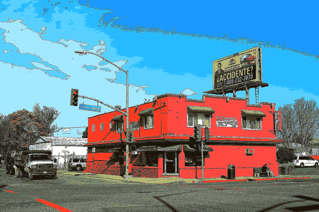
It is necessary to convert numpy array to PIL data, but once the PIL data is obtained, it is very easy to change image flavor. In addition, I found combining multiple processes from the operations produces more preferable images. I tried to convert some other photos either. The results were as follows. As a photo and illustration amateur, I feel this is good enough so far. But as you see, the original photo is important to have a good results by this process.
Code
import numpy as np      # import libraries
import cv2
import matplotlib.pyplot as plt
from sklearn.cluster import KMeans
from PIL import Image
from PIL import ImageEnhance
%matplotlib inline

img = plt.imread('data/final_image.jpg')     # load the final image and change its type to PIL image to use pillow library
arrayimage = np.asarray(img)
scale = 255.0 / np.max(arrayimage)
my_img = Image.fromarray(np.uint8(arrayimage * scale))
print(type(my_img))

# applying pillow
enhancer = ImageEnhance.Sharpness(my_img)          # change sharpness
img_1 = enhancer.enhance(3.0)

converter = ImageEnhance.Color(img_1)              # change color
img_2 = converter.enhance(3.0)

enhancer = ImageEnhance.Brightness(img_1)          # change brightness
img_3 = enhancer.enhance(1.2)

enhancer = ImageEnhance.Contrast(img_1)            # change contrast
img_4 = enhancer.enhance(2.0)

# compare the results
fig = plt.figure(figsize = (16, 16))
ax1 = fig.add_subplot(3, 2, 1)
ax2 = fig.add_subplot(3, 2, 3)
ax3 = fig.add_subplot(3, 2, 4)
ax4 = fig.add_subplot(3, 2, 5)
ax5 = fig.add_subplot(3, 2, 6)

ax1.axis('off'), ax2.axis('off'), ax3.axis('off'), ax4.axis('off'), ax5.axis('off')
ax1.imshow(img_1), ax1.set_title('Original')
ax2.imshow(img_1), ax2.set_title('ImageEnhance.Sharpness')
ax3.imshow(img_2), ax3.set_title('ImageEnhance.Color')
ax4.imshow(img_3), ax4.set_title('ImageEnhance.Brightness')
ax5.imshow(img_4), ax5.set_title('ImageEnhance.Contrast')

plt.show()

# finalize the preffered image - with some combination
enhancer = ImageEnhance.Sharpness(my_img)
img_1 = enhancer.enhance(3.0)
enhancer = ImageEnhance.Brightness(img_1)
img_2 = enhancer.enhance(1.2)
converter = ImageEnhance.Color(img_2)
img_3 = converter.enhance(2.0)
img_3.save('data/final_image_2.png')
plt.figure(figsize = (20, 10))
plt.axis('off')
plt.imshow(img_3)
plt.show()
The code is downloadable from the link below. This operation is another exercise for me. Even if you like it, use at your own risk.